In this Blog, you will learn about the most common visual design mistakes when creating eLearning. This can make your work look less professional and can make it hard for your audience to engage with your content.
1) Inconsistency
Fonts – Most common type of inconsistency is the different font families within a single project.

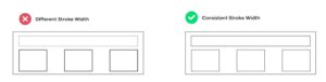
Stroke – Stroke is the outline of a shape. Varying stroke size will make project look inconsistent.
Colors – Keep colors consistent. Use black and white, and a single color that POPS for your buttons. Only add additional colors when trying to incorporate brand colors into the project.

Illustrations – Illustrations can be in different styles. Use illustrations that are consistent in style for example, art style should be similar, characters that look similar.

Layouts – Keep layouts consistent for each type of slide (one questions slide, one content slide, etc.). Only introduce variation when it’s communicating something important (Can be applied to all the topics discussed)
2) Non-Standard buttons
With the buttons use either very subtle rounding or full rounding. Either fill or stroke… not both

3) Lack of alignment
If you are getting started with instructional designing then use strong left alignment.

4) Unintentional color choice
Colors means different things. for example, if you look at red color you will probably know that this information is incorrect or it’s a warning and when you see green you will know it means correct or success. You have to be very careful when using these colors. Use grey color to represent disabled or locked.

5) Insufficient spacing
When designing whether it’s eLearning, website or an app, spacing is very important. Always give your elements room to breathe or padding (a term commonly used in web designing).