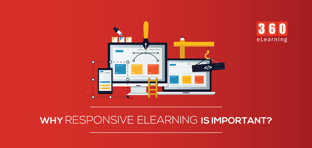
Learners today expect courses to be designed to accommodate multiple devices means responsive elearning; do your courses deliver? Long gone are the days when learners would only use desktop computers to access a fixed eLearning course but trends changed.
Today’s learners are using devices of all sizes and shapes — their mobile phones, tablets, laptops, and personal computers — and they’re often switching between them multiple times per day depending on their location. Nearly all millennials (87%) say they use two to three devices per day, and employees from all generations are expecting to receive training and learning on their mobile devices.
What is Responsive eLearning?
Although it can appear to be an intimidating topic, responsive eLearning is actually straightforward: It’s the practice of designing a single course that will look and preform great across a variety of devices and screen sizes.
You may have heard “responsive design” before — how an on-screen layout will automatically rearrange based on the screen size. It’s easy to read a four-column layout on a large monitor, but much harder to do so on a phone; with responsive design, this layout adjusts automatically on the phone to a single stacked column so that everything is clearly seen without the need for excessive zoom.
Empowering a Learner
This is about more than design. Responsive eLearning empowers a learner to achieve their necessary tasks easily and efficiently within a course— whether they’re using a desktop computer, laptop, tablet, or phone. Regardless of the device, they’re using, the actions they need to take within the course are always easily available and accessible.
Responsive eLearning also ensures that learner don’t need to spend any time squinting their eyes or zooming their screen. They simply log on to any device and pick up where they left off — focusing 100% on your course content and action items.

If you want learners to continue taking your courses, then responsive e-learning is absolutely essential. Online users are turning away from desktop computers and toward mobile phones — using their devices to browse websites, shop, and learn. Not only are users looking at their mobile phones more than 200 times per day, but they’re also switching between devices depending on their location and the goal they need to achieve.
Today’s learners — and this applies to all generations, not just Millennials — are expecting to have access to course content on their mobile devices. A Towards Maturity Report from February 2016 found that 70% of those surveyed turned to a mobile phone for e-learning, while 52% used a tablet device.
It’s all about giving learners the freedom to choose when and how they want to learn. Some will still gravitate toward desktop computers, and others will work exclusively on the go on their mobile devices. Most, however, will switch between devices and expect a smooth transition from one screen size to the next.
Responsive e-learning also helps to prepare for the future, as well. New devices are released each year, and it’s impossible to build a unique design for each and every one.
Is it difficult to create responsive e-learning courses? How can I get started?
It’s easier than you’d think to create a responsive e-learning course.
There are strategy decisions that need to be made, but these are things that all effective e-learning courses should consider, such as:
- Is the navigation menu straightforward? Challenge yourself to organize your content in a way so that the menu is straightforward and concise. If learners are spending minutes working your way through the menu to find where something is, you’re delaying them from achieving their goals.
- Is everything on screen important to help learners reach their goals? Screens that only have the essential items, and get rid of any excess, will create a better user experience for your learners and will improve your load speed.
- Are interactions as simple as possible? Learners using phones won’t be able to do right-clicks or complex keyboard interactions. Ensure that all interactions are as simple and straightforward as possible; you’ll find that this will create a better experience for all learners.
- What will this design look like on the smallest device? Envision how your course’s text, images, and interactions will appear on a small device like an iPhone. Thinking in this way will help you identify the most essential elements of your course and will create a better user experience on all screen sizes. If something is front and center at the top of a mobile screen, it should be prominent in the larger desktop view as well. Keep in mind that learners will often use landscape view instead of portrait, but may expect it to perform well on both orientations.


